Summary
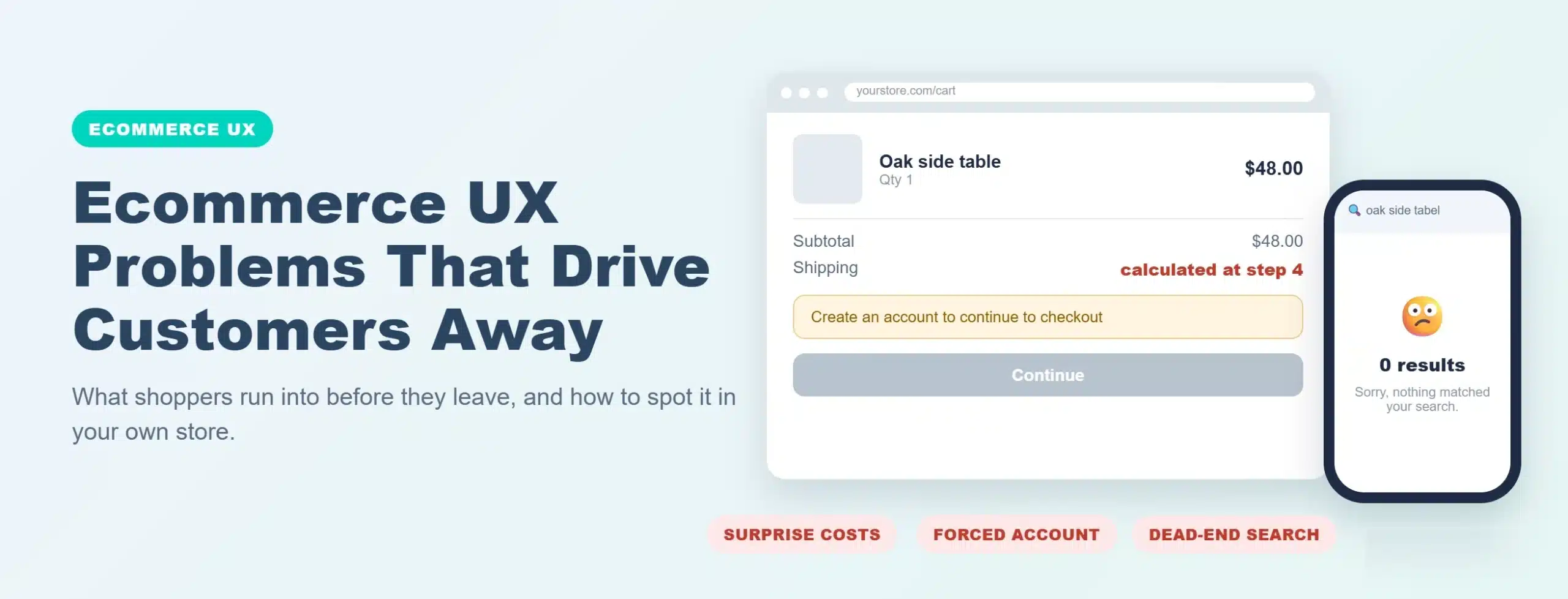
Most shoppers who leave an online store never tell you why. They just go. This article walks through the ecommerce UX problems behind most of those exits, from search that returns nothing to checkout forms that fight back, and shows how to spot which ones are costing you sales and when fixing them means a redesign.
Introduction
Nobody emails a store owner to say the filter confused them. They open a competitor’s tab instead. That silence is why UX problems survive for years on stores that otherwise look healthy. Traffic is fine, ads are running, and the numbers never quite add up.
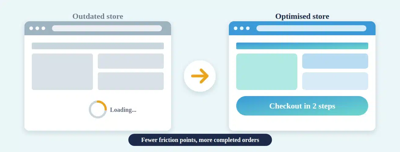
This piece covers the problems we see most often when we audit stores, why each one pushes people out, and how to tell a quick fix from a structural issue. If you want the other side of the story, how age and technical debt hold sales back, start with how an outdated ecommerce website hurts conversions.
Table of Contents
- Why do shoppers leave without telling you why?
- Can shoppers find what they came for?
- Does your product page answer the questions shoppers actually have?
- What happens when a shopper uses a phone?
- Where does checkout lose people?
- Which small details quietly erode trust?
- How do you tell which problem is yours?
- Is it a quick fix or does it need a redesign?
- How does Virtina approach ecommerce UX problems?
- Conclusion
- Frequently asked questions
Why do shoppers leave without telling you why?
Because leaving is cheaper than complaining. A shopper who hits friction has a dozen alternatives one tab away and no reason to explain themselves. What you see in your analytics is a bounce, an exit page or an abandoned cart. What you never see is the moment of confusion that caused it.
That is also why UX problems rarely show up as one dramatic failure. They show up as a pile of small ones. A menu that takes a second guess. A photo that will not zoom. A delivery charge that appears on the very last step. Each one costs you a slice of visitors, and together they decide whether a store converts well or just about gets by.
The rest of this article follows the order a shopper meets them: finding products, judging them, using the store on a phone, and paying.
Can shoppers find what they came for?
Findability is where most stores lose the first round. Two things do the damage: navigation that reflects how your company is organised, and search that cannot cope with the way customers actually type.

Navigation built around your org chart
Menus often mirror internal departments or supplier names. Shoppers think in jobs and problems, like “something for a small bathroom”, not “Series 400 fixtures”. When category names only make sense to your team, people open three menus, give up on the third and leave. A mega menu with forty links does not fix this. It just hides the problem behind more clicking.
Search that returns nothing
People who use site search are your most motivated visitors. They already know what they want. If a plural, a typo or a part number sends back “no results”, you have turned away your best prospect at the door. Pull your zero-result search queries and read them. It is one of the quickest ways to learn what customers want that your store is failing to show them.
Filters that fight back
Filters that reset after every click, hide how many items match, or reload the page and drop the shopper back at the top all feel like work. On a catalogue of a few hundred products, good filtering is the difference between browsing and bouncing.
Does your product page answer the questions shoppers actually have?
A product page has one job, which is to remove doubt. Plenty of them do the opposite.

The usual culprits are a single photo with no zoom and no sense of scale, a description copied word for word from the supplier, and missing basics like sizing, compatibility, materials or delivery time. When shoppers cannot find an answer, they go and look for it somewhere else. Most of them do not come back.
B2B stores have their own version of this. No tiered pricing, no spec sheets to download, “call for price” where a number should be, and no simple way to ask for a quote. A buyer comparing three suppliers will not phone to find out what you charge when the other two just tell them.
Reviews matter here too. Hidden, buried or missing reviews leave the shopper to judge the product on your word alone, and your word is the least convincing source on the page.
What happens when a shopper uses a phone?
Most stores are “responsive” in the sense that nothing visibly breaks on a small screen. That is a low bar, and it is not the same as being easy to use.

Look for tap targets that are too small for a thumb, a sticky header that swallows a third of the screen, pop-ups with a close button you cannot hit, tables that scroll sideways, and checkout fields that open the wrong keyboard. A page can pass a technical mobile test and still be miserable to shop on.
The best test costs nothing. Take a mid-range phone, switch off the Wi-Fi, and try to buy something from your own store. If you feel like giving up halfway through, your customers did a while ago.
Where does checkout lose people?
Checkout is the one place where UX problems turn straight into lost revenue, because the shopper has already decided to buy. These are the ones we run into most:
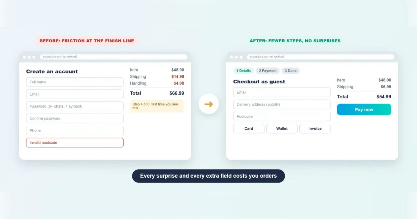
Forced account creation. Someone who wants to buy one item once does not want a password to remember. Offer guest checkout and invite them to save details afterwards.
Surprises at the end. Shipping, handling or tax that only appears on the final step feels like a bait and switch. Show estimates early, on the product page or in the cart.
Long, unforgiving forms. Every extra field is a small tax. Remove anything you do not need, support autofill, and put error messages next to the field that caused them instead of in a red banner at the top that sends people hunting.
Too few ways to pay. If your customers expect a wallet or a card on file and you only offer one option, some of them will simply stop.
No sense of progress. People tolerate a few steps if they know how many are left. A checkout that feels endless gets abandoned.
Which small details quietly erode trust?
Some problems are not about usability at all. They are about whether the store feels safe to hand money to.
A return policy that is hard to find. No phone number or address anywhere. A footer that still says 2019. Broken images, or a page that mixes three visual styles because it has been patched by three different plugins. Newsletter, chat, cookie and discount pop-ups all firing within the first few seconds. Each one is minor on its own. Together they tell the shopper that nobody is looking after the place.
Out-of-stock dead ends belong on this list too. A product page that says “sold out” and offers nothing else, no alternative, no back-in-stock alert, gives the shopper nowhere to go but away.
And do not skip accessibility. Low-contrast text, missing focus states and menus that cannot be used with a keyboard shut out real customers, and they usually point to deeper problems in how the theme was built.
How do you tell which problem is yours?
You do not need a research budget. A handful of sources will show you most of what is wrong.
Your funnel by device. Look at where visitors drop off on mobile compared with desktop. A big gap at one step usually points at one specific problem.
Zero-result searches. Read them. They are a list of things customers wanted and could not find.
Session recordings. Watch twenty sessions end to end. Patterns show up faster than you would expect, mostly in the form of people rage-clicking on things that do not respond.
Your support inbox. Questions that keep coming back, like “where is my order” or “do you ship to Canada”, are UX bugs in disguise. The answer should have been on the page.
Your own phone. Buy something. Time it. Notice every moment you hesitate.
If the same problems keep coming back after you fix them, the cause may be deeper than the page. Redesign or rebuild: six calls that decide what your store needs helps you work out which it is.
Is it a quick fix or does it need a redesign?
Most of the problems above can be fixed in place. Better filters, guest checkout, upfront shipping costs and richer product pages do not need a new website. They need someone to decide to do them.
The honest cases for a redesign are the ones where the build itself is in the way. Checkout locked inside a legacy template. Navigation hard-coded into the theme. A mobile layout that has to be rebuilt rather than patched. Every small change needing a developer for a week. A quick test: list the last five UX changes you wanted to make and count how many the platform blocked. If it is most of them, patching will keep costing more than it returns.
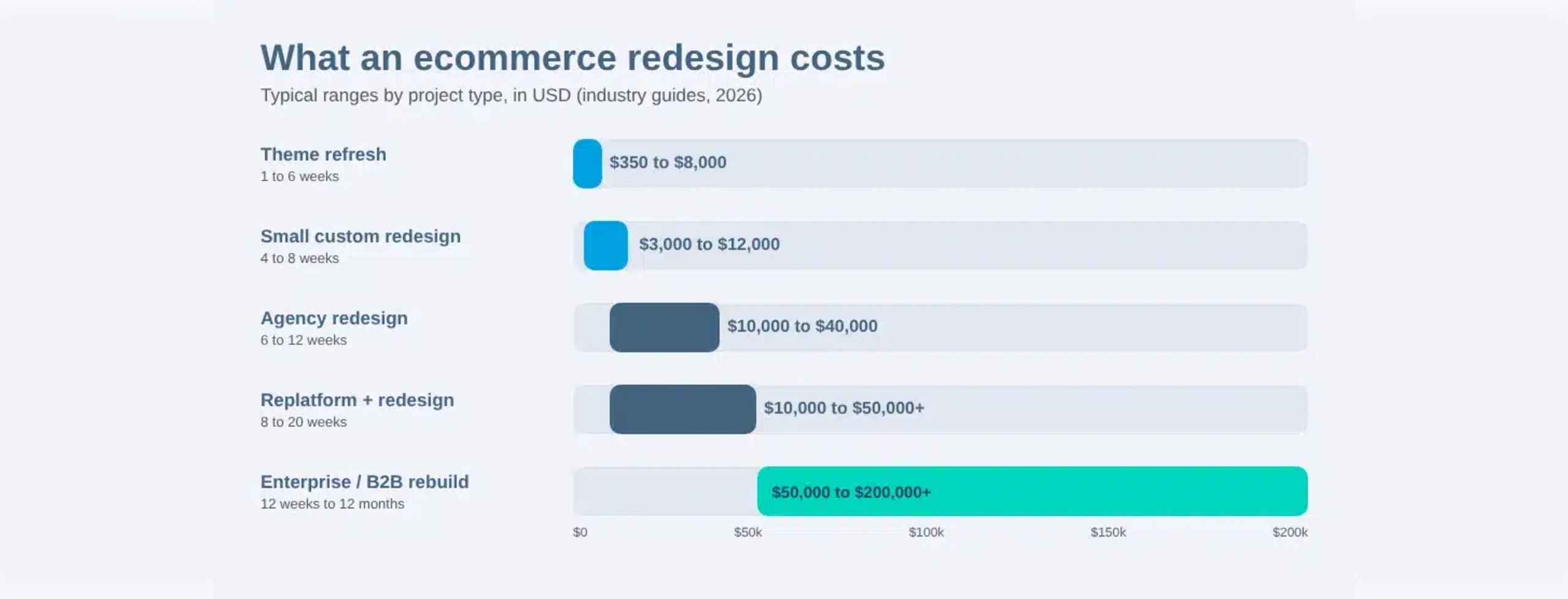
Budget tends to be the next question, so it helps to know what an ecommerce website redesign costs before you talk to anyone.
How does Virtina approach ecommerce UX problems?
We start with an audit, not a mock-up. Speed, mobile experience, navigation and checkout get looked at first, because that is where the money is leaking. Anything that can be fixed in place is flagged as a fix. Anything the platform prevents is flagged as a structural issue, so you know whether you are buying a repair or a rebuild.
If a redesign is the right call, our ecommerce website redesign service is built around keeping what already works: rankings benchmarked before any change, every old URL redirected and tested, and 30 days of monitoring after launch.
Worried about losing traffic along the way? Here is how to protect your rankings through a redesign.
Want to see what we would change before committing to anything? Request a free redesign audit and we will show you.
Conclusion
Customers rarely leave because of one big mistake. They leave because search missed, the product page left a question open, the phone experience was clumsy, or checkout asked for one thing too many. The good news is that most of these are cheap to find and fixable without starting over.
Fix what is local first, and be honest about the few problems that come from the build itself. That keeps you from either patching forever or rebuilding before you need to.
Frequently Asked Questions
What is the biggest ecommerce UX problem?
There is no single answer that fits every store. For most, checkout and mobile experience carry the largest losses because they sit closest to the sale. Your own funnel data should decide where to look first.
How can I find UX problems without a big budget?
Start with funnel drop-off by device, zero-result search queries, a few session recordings, the questions your support team keeps answering, and your own attempt to buy something on a phone. Together they usually surface the main issues in an afternoon.
Do UX problems affect SEO?
Indirectly, yes. Slow pages, intrusive pop-ups and poor mobile layouts push visitors away, and those engagement problems can feed into how a page performs in search. The bigger SEO risk is usually fixing UX through a redesign without protecting URLs and redirects.
How long before UX fixes show results?
Small changes such as guest checkout or earlier shipping costs can show up in your data within a few weeks, depending on traffic. Record a baseline before you change anything so you can tell what actually moved.
Do I need a full redesign to fix these problems?
Usually not. Most UX problems can be fixed in place. A redesign makes sense when the platform or theme blocks the changes you need, or when every fix has become slow and expensive.
How often should I review my store UX?
A light review every quarter works well for most stores, plus a fresh look after any platform upgrade, theme change or major campaign.