Summary
In 2026, redesigning an eCommerce website isn’t just about making it look better. Yes, speed, mobile friendliness, clear navigation, and a smooth checkout still matter, but they’re no longer the whole story.
Key points:
- AI personalizes the experience by responding to each visitor individually
- Smarter search, navigation, and recommendations reduce friction
- Speed, mobile usability, and a simple checkout remain essential
- The goal is a site that learns, adapts, and drives consistent growth
A few years ago, redesigns were pretty simple. You’d clean up the layout, make sure the site worked on mobile, and maybe change the fonts or colors. That stuff still matters. But now there’s another layer to think about.
AI enables your store to respond to each visitor in real time. It can surface products people are more likely to buy, suggest bundles based on what they’ve purchased before, and point out parts of the site that aren’t working well without someone constantly tweaking things.
If you’re planning a redesign for 2026, you really can’t ignore AI anymore. It’s baked into how modern stores work. Large retailers already use it to personalize shopping, predict demand, streamline conversion paths, and automate work that used to take weeks. This guide is here to help you rethink your redesign with that reality in mind: what to focus on, which features matter now, and how to make changes that actually improve performance and conversions without complicating things.
Table of Contents
What is an eCommerce Website Redesign and Why Does It Matter?
Websites don’t stay perfect forever. You launch an online store that looks good for a while, and then, slowly, things start to feel outdated. Pages may load slowly, the design may feel outdated, or customers keep asking how to find items. That’s when a redesign comes in.
A redesign isn’t just slapping on a new color scheme. It’s about making the site work better, faster, easier to navigate, mobile-friendly, and less frustrating for users. Because let’s face it, if someone lands on your site and it’s confusing or slow, they’re out. No second chance.
A solid redesign focuses on:
What Is AI-Powered Web Design?
AI-powered web design isn’t about replacing people. It’s more like having an assistant who takes care of the repetitive work you’d typically spend hours on. Things like organizing layouts, picking color schemes, deciding where content should go, or even noticing how visitors move through a page. But the big-picture decisions? Those are still yours.
Right now, tools like Wix ADI or Framer AI can take a few instructions and generate a rough website draft. Not something you’d launch immediately, but enough to start from. Figma AI works alongside designers, offering suggestions for spacing, alignment, or sections that feel cluttered. For visuals, tools like Midjourney can generate images that match your brand’s tone, saving significant time compared to designing everything from scratch.
The key is using AI as a partner, not a replacement. Humans still control strategy, brand voice, content priorities, and the user journey, while AI handles small tasks and can flag issues you might miss. For instance, it might notice buttons people ignore, pages that load too slowly, or sections that users skip.
When used this way, AI makes websites faster and smoother for visitors. Navigation feels easier, pages load quicker, and the site just works better. Most users won’t even notice AI is involved; they’ll just feel like the site is intuitive. And your team can focus on bigger things like strategy, content, or testing new ideas instead of constantly tweaking layouts or visuals.
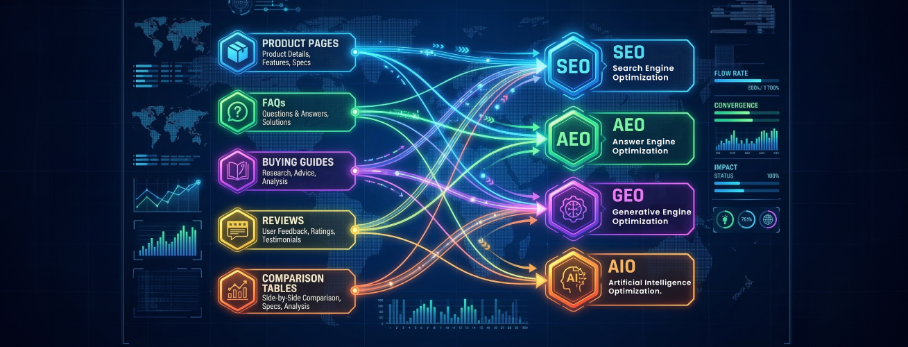
How AI Is Changing eCommerce Website Design in 2026

If you’ve redesigned a website anytime in the last few years, you probably remember the routine: new colors, neater layouts, faster pages, and cleaning up the messy backend. Pretty standard stuff. But somewhere between then and now, AI sneaked into everything. And suddenly the whole idea of “design” feels different. It’s not just about placing buttons and images anymore. Half the time, the site is making decisions on its own, reacting to shoppers in real time, doing things you didn’t technically “design,” but it works anyway.
AI-Driven Personalization
What used to be a simple “You might also like…” box has become a strange, almost personal version of your store for every visitor. One person opens your site and sees a big hero banner full of sneakers. Another sees home décor. It’s the same homepage, but it behaves like it’s rearranging itself depending on who’s looking. Sometimes you even forget it’s AI doing this because it feels like the site simply gets what the person is into. It’s not perfect, but it’s surprisingly natural.
AI-Optimized Navigation
Your menu isn’t static anymore either. Instead of you deciding what goes on top, AI watches how people move around. Which categories they click first, which pages nobody seems to care about, and where people keep hesitating. And then it shifts things around, quietly. You might log in one morning and notice a few things have moved, not because a designer changed it, but because the site figured out a better way to help people find stuff. It almost feels like the store tidies itself overnight.
Smarter Search
Search has honestly changed the most. Before, you typed one wrong word and the site just shrugged at you. Now the search bar feels more like you’re talking to someone who works there. You can type half a description, a typo-filled word, or something vague like “the blue thing for the kitchen,” and it somehow knows what you mean. It doesn’t feel robotic anymore. It feels… helpful. And when search feels helpful, people stop bouncing around confused.
AI Helping With UX Decisions
Design tweaks also don’t rely on endless testing cycles the way they used to. AI looks at user behavior basically as it happens, where people hover too long, which buttons they ignore, which sections nobody scrolls to, and spots patterns you would never catch manually. Instead of weeks of “Let’s test two versions,” it gives you a nudge like, “Hey, this section is doing nothing,” or “People seem to miss this button.” It’s not as fancy as it sounds; it just saves you a lot of guesswork.
AI-First Customer Support
Customer support has gone from “annoying pop-up chat” to something that almost feels like a built-in guide. The bots can now handle tasks that typically require a human, such as tracking orders, correcting errors, recommending a better size, or calming a frustrated shopper who can’t find where to enter their address. And weirdly, shoppers don’t mind it as much because the experience doesn’t feel robotic like it used to. It’s quick, which is what people want anyway.
Predictive Shopping
Maybe the biggest shift is how AI predicts things before shoppers even think about them. If someone usually buys something every month, the site reminds them before they run out. If they keep hovering around a certain product category, the site nudges similar items forward. It’s like the site develops a bit of intuition. Not perfect intuition, but enough that the shopping experience stops feeling like a hunt and starts feeling like a suggestion.
What’s New in 2026 vs. Older eCommerce Redesigns
Feature | Older Redesigns (Before 2026) | 2026 Redesigns (AI-Driven) |
|---|---|---|
Layout | Static layouts that stayed the same for everyone. | Layouts that adjust automatically using AI. |
Product Sorting | Manual product sorting by merchandisers. | AI-led product sorting based on demand, trends, and user behavior. |
Search Function | Basic search with exact keyword matching. | Predictive search that understands intent and corrects mistakes. |
Personalization | One-size-fits-all homepage and product recommendations. | Real-time personalization for each visitor. |
Merchandising Updates | Merchandising is updated manually weekly or monthly. | Automated merchandising that updates itself in real time. |
Layout Testing | Designers are manually testing different layouts. | AI-generated layouts for promotions and campaigns. |
Navigation | Users rely mostly on clicking through menus. | Voice search is becoming common for faster navigation. |
Immersive Shopping | Limited or no immersive shopping tools. | AR try-ons for beauty, fashion, eyewear, and home products. |
People Also Ask
How do you know your eCommerce site needs a redesign?
Pages feel slow, things look cluttered, and customers start asking where basic stuff is. Sometimes the site just looks tired. And when you feel a bit uncomfortable sharing the link with someone… yeah, that’s a sign right there.
Will a redesign hurt SEO?
It can, but only if the basics get ignored. Stuff like URLs, redirects, titles, all that. When those are appropriately handled, SEO stays fine. Google might shuffle things around for a bit, but it usually settles down.
What does a redesign cost?
There’s no fixed number. Simple stores need less work. Larger stores or anything custom… that climbs up. As with renovating a house, you only know the real cost once you see what needs to change.
What Are the Benefits of Redesigning Your eCommerce Store?

Why even bother redesigning an eCommerce site? When a site feels old or clumsy, people leave. When it feels clean and easy, they stay.
Improved User Experience
If the site looks crowded or confusing, people lose patience. A redesign just clears the mess. Things fall into place, menus stop feeling like a puzzle, and checking out doesn’t feel like a fight. When everything is simple, people stick around longer without thinking about it.
Higher Conversions
Most shoppers just want a straight path. Clear buttons, a layout that doesn’t make them stop, and a buying flow that feels natural. When that’s there, more people actually finish the order instead of giving up.
Faster Pages
Nobody waits for slow pages anymore. A second or two and they’re gone. A redesign helps cut the heavy parts and gets things loading fast again. Quick pages are easier to use.
Mobile-Friendly
Most people shop on their phones now. If the site breaks on a small screen or requires constant pinch-zooming, customers disappear. A redesign fixes all that and makes the whole thing feel right on mobile.
Modern Look
If a site looks outdated, people immediately get a negative impression. A clean, current look builds trust without saying a word. A redesign isn’t just about making the site look pretty. It makes the entire store easier to use, faster to load, and more comfortable for real shoppers.
What Are the Core Features of a Modern eCommerce Website Redesign?
If you’re thinking about giving your online store a facelift, there are a few things you really want to get right. It’s not just about looking fancy; your site must work for the people visiting it. Here’s what matters most:
Fully Responsive and Mobile‑Ready Layout
Phones, tablets, weird small laptops, you name it, people are shopping on them. Your site has to look decent on all of them. No tiny buttons, no awkward scrolling, no squished images. It should work everywhere without causing frustration.
Streamlined Site Speed and Performance
A redesign can remove unnecessary elements, reduce image sizes, and speed up the process. Fast sites just feel better to use, and that helps keep customers around.
Improved Navigation and Product Organization
Ever go to a website and stare at the menu, wondering where anything is? Don’t make your customers do that. Arrange products in a logical order. Keep menus simple. Show related items to make browsing easier.
Enhanced Product Pages with Better Content
Product pages need to answer questions before anyone asks. Pictures, specs, reviews, videos, it all helps. A redesign can make these pages actually useful rather than merely “there.” People are more likely to buy when they feel confident about what they’re getting.
Great product pages answer questions instantly:
Secure and User‑Friendly Checkout Process
Checkout should be painless. Fewer steps, clear forms, obvious payment options, and making people feel safe about their info all matter. If it’s tricky or scary, folks will abandon their carts.
AI‑Powered Innovations for Modern eCommerce
Some sites now offer AI features such as personalized product suggestions or chatbots. Done right, it’s super helpful and feels smart, not gimmicky. It makes shopping smoother and can even boost sales.
2026 eCommerce isn’t complete without AI features like:
What 5 Steps Lead to a High-Impact eCommerce Website Redesign?
Redesigning a website can feel like a total headache. But honestly, if you take it one step at a time, it’s not that bad. Here’s how I’d do it if I were giving my own store a makeover:
Step 1: The Audit What’s Working (and What’s Not)?
Start by just wandering through your site like a regular visitor. Click stuff, scroll around, get a bit frustrated, and what bugs you. Is that menu confusing? That slow page? Write it down. You need that before doing anything else.
Step 2: Focus on UX (User Experience) First
Can people find stuff easily? Is checkout obvious? Little things like where buttons sit and how menus pop up can totally change the experience.
Step 3: Rethink Your Product Pages
These pages are make-or-break. Tiny photos, confusing descriptions, missing info, people bail fast. Add clear pics, descriptions, and a short video. Just make it obvious what they’re buying. Don’t overthink it, honestly.
Step 4: Streamline the Checkout Process
Checkout can ruin sales. Too many steps, unclear forms, weird payment options, boom, cart abandoned. Make it simple. Fewer clicks, clear instructions, and make it evident that people’s info is safe. Pretend you’re buying something yourself, would it be?
Step 5: Test, Launch, and Iterate
Launch, watch how people use it, tweak what’s broken. Maybe something you thought was obvious isn’t. Perhaps a new feature doesn’t work as planned. That’s okay. Websites evolve. They’re never “done” anyway.
What Are the Best Practices for Redesigning Your eCommerce Website?
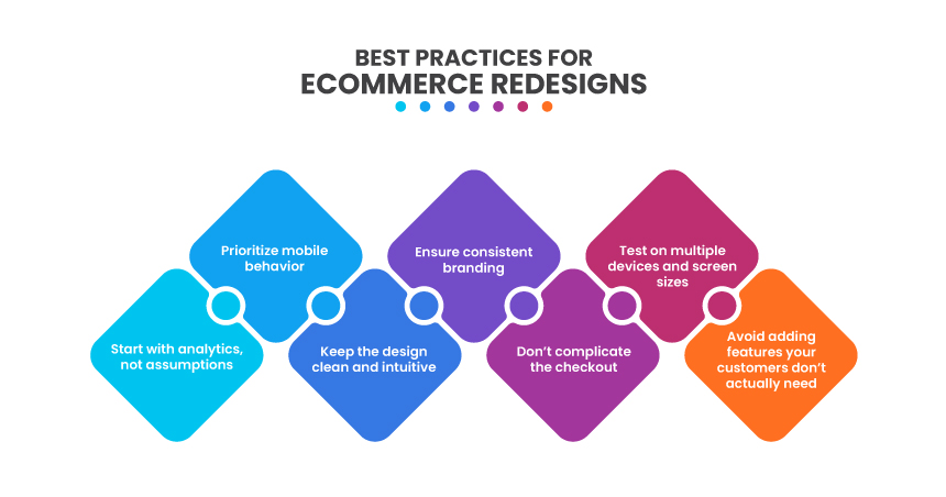
Redesigning a site looks scary at first, but it’s mostly small things stacked together. One step at a time, and it’s not so bad.
Look at Data First
Don’t guess. See where people click, where they leave, and which pages they skip. Some things you think are fine are actually annoying. Numbers tell the truth.
Make the Site Easy to Use
If people can’t find stuff fast, they leave. Menus should make sense. Buttons should be obvious. Product pages shouldn’t hide anything. Fancy visuals don’t help if they confuse people.
Think Mobile
Everyone’s on their phones. Tiny buttons, cramped screens, slow scrolling, people bounce fast. A few tweaks make it scroll and tap nicely. That’s it.
Checkout Needs to Be Simple
Too many steps, weird forms, missing payment options, goodbye cart. Keep it short, clear, and safe. If it annoys you, it annoys them.
Keep Branding Consistent
Colors, fonts, tone, make them all match. Messy visuals make people hesitate. Consistency makes it feel solid and trustworthy.
What Cost Factors Should You Consider in an eCommerce Website Redesign?
Redesigning a website isn’t cheap, and if you don’t plan, the costs can sneak up on you. Here are some things to keep in mind:
Scope and Complexity of the Project
How big is your website? How many pages, products, or categories do you have? Bigger sites with tons of pages and complex structures take longer, which usually means higher costs. Simple sites are easier, obviously.
Design and Customization
Are you tweaking a template a bit or building something from scratch? Custom items look better but take longer and cost more. Templates are faster and cheaper, but they can make your site look like everyone else’s.
Platform and Technology
Shopify, WooCommerce, Magento, or something else? Each one hits your budget differently. Some are easier to use; some require more technical know-how. The platform you choose can significantly affect costs.
Features and Functionality
Do you need advanced search, product suggestions, AI tools, or extra integrations? Each feature adds work and increases costs. Even small “nice-to-have” things can pile up faster than you think.
Content Creation and Product Assets
Good photos, videos, descriptions, and other product content take time and money. If you don’t already have them, plan for it. Creating quality content is a big part of the redesign cost.
Key Challenges and Solutions in eCommerce Website Redesign
Key Challenges | Solution |
|---|---|
Drop in Conversions | Users are accustomed to the old layout, so even minor design changes can confuse them. Track user behavior through session recordings or heatmaps, identify where they hesitate or drop off, and adjust quickly. Sometimes moving a button or restoring a familiar element solves the issue. |
SEO Traffic Loss | URL changes, content shifts, or missing metadata can hurt search rankings. Plan 301 redirects before launch, keep important keywords intact, and run an SEO audit right after going live. Traffic usually stabilizes after a few weeks if handled correctly. |
Project Expansion | Redesigns grow beyond the original plan. Separate absolute must-haves from nice-to-haves, stick to your primary goals, and evaluate every new request against budget and deadlines. Saying “not now” helps keep the project on track. |
Poor User Experience | A fresh design doesn’t guarantee usability. Conduct usability testing to observe how real users navigate the new site, identify pages where they get stuck, and address friction points. Smoother navigation = happier customers. |
Why You Should Partner With Virtina to Redesign Your eCommerce Website
We aren’t just another agency. We know what actually works in eCommerce. We’ve seen sites that look good but don’t sell, stores that frustrate users, and platforms that choke under traffic. We know how to fix all that. Every redesign is different because no two businesses are the same. We dig into what your customers want, what works for your industry, and what will actually boost conversions, not just make things “pretty.”
Are you looking for eCommerce website services?
Conclusion
Redesigning your store can feel overwhelming. But it’s not just about looks. Pages need to load fast. Menus have to make sense. Checkout has to be simple. And it all has to work on phones. Miss any of that, and people leave, just like that.
It won’t be perfect at first. You’ll tweak things, test stuff, maybe redo a part or two. That’s normal. What really matters is having someone who knows eCommerce. We don’t just make it look good, we make it work, grow, and keep customers coming back.
A redesign isn’t just a project. It’s about putting effort into your business, staying competitive, and making sure people stay.
Frequently Asked Questions (FAQs)
Most of the time, yes. People buy more when the site loads quickly and the process feels smooth. If your old layout was confusing, even small improvements can make a big difference.
Think about what annoys you now. Think about what you need later. Shopify is simple, WooCommerce gives you more control, Magento is built for big operations. Pick what fits your growth, not just today.
Yeah, it’s worth it. Old photos and vague descriptions hold people back. If you’re redesigning anyway, it makes sense to clean this up too.
Try it on your own phone, then try it on someone else’s. Don’t assume the developer’s preview tells the whole story. If you have to pinch and zoom, something’s off.
They’ve already been through all the weird headaches that come with eCommerce projects. It saves a ton of time, and you end up with a site that not only looks better but actually works better.